Dark vs. Light T-Shirts: How Shirt Color Affects Your Printed Design
- Artwork Guides & Print Setup
Choosing between dark and light T-shirts might seem like a simple decision, but garment color can significantly change the appearance of a printed design.
A logo that stands out on a white shirt may look completely different on black, navy, or charcoal fabric. Even when the same artwork is used, the background color can affect contrast, readability, and how vibrant the final print appears.
For businesses, schools, teams, and individuals ordering custom printed T-shirts, understanding these differences can help prevent disappointing results.
The best shirt color isn’t necessarily the most popular one. It’s the color that complements your artwork, supports your intended style, and works with the selected printing technique.
How Shirt Color Influences Printed Artwork
A T-shirt is more than a surface for printing. Its color becomes part of the overall composition.
On dark garments, light-colored artwork can create a bold appearance. On light garments, darker ink often provides a clean and recognizable design.
However, choosing colors with similar brightness can make important details difficult to distinguish.
For example, dark blue lettering on a black shirt may appear subtle, while the same lettering on white fabric becomes noticeably clearer.
This relationship between garment color and printed artwork is called contrast. Understanding it helps you make better design decisions before production.
Printing on Dark T-Shirts
Black, navy, charcoal, and other dark T-shirts are popular for modern, professional, and bold designs.
These garments can create strong contrast with white, cream, yellow, and certain other light-colored inks.
Why White Ink Works Well on Dark Shirts
White artwork against dark fabric often provides excellent visibility.
This makes it suitable for company logos, simple illustrations, event graphics, and typography-focused designs.
However, printing on dark fabric sometimes requires additional preparation to achieve the desired opacity.
In screen printing, an underbase may be applied beneath certain ink colors to help prevent the dark fabric from affecting their appearance.
The appropriate method depends on the garment, ink system, and artwork requirements.
When Dark Shirts May Not Be Ideal
Dark shirts may not provide sufficient contrast for artwork containing similarly dark colors.
Small lettering or delicate details can become especially difficult to read.
Before selecting a dark garment, review the design at its intended size and consider whether all essential elements remain recognizable.
Printing on Light T-Shirts
White, cream, light gray, and other pale garments provide a different visual foundation.
They often work well with black, navy, dark green, and other deeper ink colors.
Light shirts can create a clean appearance suitable for minimalist designs, school apparel, and promotional clothing.
They may also complement artwork featuring several colors, depending on the printing process.
Choosing Ink Colors for Light Shirts
Dark artwork generally provides clear visual separation against pale fabric.
However, light gray, pastel yellow, or cream designs may look less noticeable against white shirts.
Subtle combinations are not necessarily incorrect, but they should be intentional.
For designs containing important business information, readability should take priority over a delicate visual effect.
Understanding Color Contrast
Contrast determines how easily viewers can distinguish printed elements from the garment.
High-contrast combinations often improve readability, particularly when artwork contains small text or recognizable symbols.
Consider these common pairings:
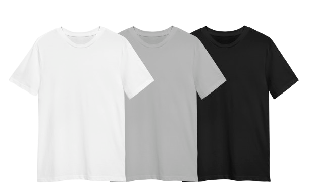
Black T-shirt with white ink: Bold and recognizable.
White T-shirt with black ink: Classic and straightforward.
Navy T-shirt with cream ink: Professional and balanced.
Light gray T-shirt with dark blue ink: Clean and versatile.
Cream T-shirt with pale yellow ink: Subtle, but potentially difficult to read.
Adobe’s guide to color contrast explains how differences in brightness, hue, and saturation influence visual clarity.
When choosing colors, evaluate the finished combination rather than selecting the ink and garment independently.
How Printing Methods Affect Dark and Light Shirts
Screen printing and direct-to-film printing handle artwork differently.
Screen printing applies ink through prepared screens. Depending on the design, dark garments may require an underbase to support certain printed colors.
Direct-to-film printing uses a prepared transfer applied with heat and pressure. This process can accommodate detailed multicolor artwork and may use white ink layers to maintain opacity.
Neither method is automatically better for every garment.
The appropriate choice depends on the design, number of shirts, fabric composition, and desired finish.
Customers comparing their options can review the DTF printing services at Aaron’s Designs.
Check Fabric and Artwork Before Ordering
Garment material can also affect the finished print.
Cotton, polyester, blended fabrics, and heathered garments have different surface and production characteristics.
A color combination that looks attractive on one fabric may appear different on another.
Before approving your order, compare realistic mockups showing the exact garment color and intended print size.
Check small lettering, thin lines, and detailed artwork carefully.
If your design includes a logo or illustration, preparing the correct file is equally important. The custom shirt artwork guide explains file types, resolution, and other preparation considerations.
Frequently Asked Questions
Is it better to print on dark or light T-shirts?
Neither option is universally better. The right choice depends on the design, intended appearance, and printing technique.
Dark shirts often create strong contrast with light-colored artwork, while light shirts work well with darker designs.
For company shirts, brand consistency and readability should influence the decision. For personalized apparel, the preferred style may be more important.
Comparing the same design on both garment colors can help reveal which combination communicates the intended message more effectively.
Do printed colors look different on black and white T-shirts?
Yes. Colors can appear different because the garment background influences how viewers perceive them.
The printing technique also matters. Certain designs printed on dark shirts may require supporting ink layers to achieve the intended appearance.
On light shirts, some colors may appear different because the background provides less contrast or creates a softer visual effect.
Reviewing realistic mockups and discussing production requirements with the printer can help establish appropriate expectations before ordering.
What ink colors stand out best on black shirts?
White, cream, and certain bright colors often provide noticeable contrast against black fabric.
However, the best ink color depends on the design’s purpose.
A business logo may benefit from white lettering for clarity, while an event graphic may use a brighter color for a more energetic appearance.
Dark gray, navy, and similarly dark shades may be difficult to distinguish.
Customers should review the proposed combination at its actual print dimensions, especially when the design contains fine details or small lettering.
Does printing on dark T-shirts cost more?
Sometimes, but not always.
Certain screen-printing projects involving dark garments may require additional production steps, such as an underbase.
However, the final price depends on more than garment color. Order quantity, artwork complexity, garment style, printing method, and number of print locations can also affect costs.
Rather than assuming dark shirts are automatically more expensive, request a quotation using the specific garment and artwork you plan to order.
This provides a more realistic comparison between available options.
Can I use the same logo on dark and light T-shirts?
Yes, although some designs may need an approved color variation to maintain visibility.
For example, a black logo may work well on white fabric but become difficult to recognize on a black shirt.
Using a white version of the logo on darker garments can help preserve its appearance.
Businesses should avoid making unnecessary changes to important brand elements.
Review each garment combination and confirm that the design remains consistent with the organization’s visual identity.
How can I choose the best shirt color for my design?
Start by identifying the artwork’s most important elements.
Choose garment colors that provide enough contrast for lettering, logos, and illustrations to remain recognizable.
Consider who will wear the shirts, the intended occasion, and how the garments will be used.
Compare a small selection of colors rather than evaluating dozens of possibilities.
Finally, review the artwork at its actual printed size and ask the printing provider about any technical considerations. A careful comparison can help avoid color combinations that appear attractive digitally but lack clarity on fabric.
Final Thoughts
The difference between dark and light T-shirts goes beyond personal preference. Garment color influences contrast, readability, visual style, and sometimes the printing process itself. Dark shirts can provide a bold background for lighter designs, while light shirts can create a clean appearance for darker artwork. The strongest results come from choosing the garment and design together, preparing the artwork correctly, and confirming production requirements before printing.
If you’re deciding which colors will work best for your next custom shirt project, contact Aaron’s Designs to discuss your artwork, preferred garments, and available printing options.