Single-Color T-Shirt Designs: How to Make a Simple Print Stand Out
- Artwork Guides & Print Setup
Creating an attractive custom T-shirt does not always require multiple colors or complicated artwork. Sometimes, one carefully chosen ink color can produce a design that looks professional, stylish, and easy to recognize.
Single-color T-shirt designs are popular for business uniforms, school activities, team apparel, promotional events, and personalized shirts. Their appeal comes from simplicity, allowing the artwork to stand out through strong shapes, readable lettering, and thoughtful placement.
However, a simple design still requires planning. Choosing the right shirt color, adjusting the size of the artwork, and preparing the file correctly can make a significant difference in the finished print. Whether you’re creating shirts for your business or a special occasion, understanding these details can help you achieve a more polished result.
Why Single-Color T-Shirt Designs Work
Single-color printing uses one ink color to create a design on fabric. The artwork can include a company logo, text, illustrations, or geometric patterns, provided the elements are prepared for the selected printing method.
One of the advantages of this approach is its clean appearance. With fewer colors competing for attention, the main message becomes easier to recognize. This makes it especially useful for businesses that want professional-looking shirts without an overly decorative design.
Single-color artwork can also be practical for group orders because a consistent design can be repeated across multiple garments. If you’re exploring custom apparel, the custom T-shirt printing options at Aaron’s Designs can help you understand the available garment choices.
Choose the Right Ink and Shirt Color
The combination of ink and fabric color plays an important role in how a design appears. Strong contrast makes lettering and illustrations easier to see, while colors that are too similar may cause important details to blend into the garment.
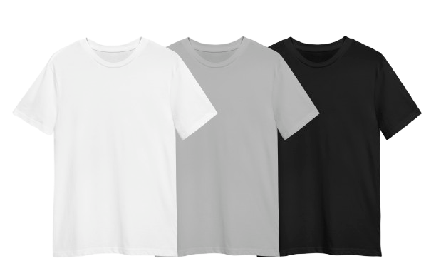
For example, white ink on a black or navy T-shirt creates a bold appearance, while black printing on white or light gray fabric provides a classic and straightforward look. Other combinations, such as cream on forest green or dark blue on a beige shirt, can create a softer style without making the design overly complicated.
The best color combination depends on the purpose of the shirt. Business uniforms often benefit from recognizable branding, while event shirts may use brighter colors to create a more energetic appearance. Adobe’s color contrast guide provides useful background on how color differences influence visibility.
Keep the Artwork Clean and Readable
A successful one-color design should communicate its message without unnecessary decoration. Rather than combining several fonts, graphics, and slogans, focus on the elements that matter most to the intended audience.
For business shirts, a clear company logo or name may be enough to create a professional appearance. Event shirts might feature a large title with a small supporting illustration, while personalized designs can highlight a meaningful phrase or simple graphic.
Typography deserves particular attention because thin lettering and extremely small text may become difficult to read when printed. Choose fonts that match the design’s purpose and leave enough space between letters and graphic elements. A balanced composition often looks more complete than one filled with decorations.
Using empty space around the artwork can also improve the overall appearance by helping important elements stand out.
Select the Best Print Placement
The position of the artwork influences how the shirt looks when worn. A small left-chest print can create a subtle, professional appearance, making it suitable for employee uniforms and minimalist designs.
For promotional shirts or events, a larger front design may provide stronger visibility and allow more room for typography or illustrations. Back printing is another option, particularly when the artwork includes a larger logo or a message intended to be seen from a distance.
Some businesses combine a small front logo with a larger back design to create a coordinated appearance. However, the placement should match the garment and the purpose of the shirt rather than simply filling available space.
You can also browse the Aaron’s Designs gallery for examples of custom apparel and different printing styles.
Prepare Your Design for Printing
Even the simplest artwork needs proper preparation. A design that looks sharp on a computer screen may lose clarity when enlarged or printed onto fabric, especially if the original file has a low resolution.
Vector artwork is often useful for logos and illustrations because it can be resized without becoming pixelated. Before submitting your design, check that the text is readable, the lines are sufficiently clear, and the artwork is suitable for the intended print dimensions.
The custom shirt artwork preparation guide explains file requirements and important considerations for preparing custom printing projects.
It is also helpful to review a realistic mockup before approving production. This allows you to check whether the design looks balanced on the chosen shirt and whether the ink color provides enough contrast.
Is Screen Printing a Good Choice for One-Color Designs?
Screen printing is a common method for producing single-color designs, particularly when several garments require the same artwork. The process transfers ink through a prepared screen, allowing the design to be reproduced across multiple shirts.
A straightforward one-color design may require fewer color separations than a multicolor project, although the final cost still depends on garment selection, quantity, print size, and placement.
Businesses and organizations planning coordinated orders can explore screen-printing services to learn more about the process. The right printing method should always be selected according to the actual artwork and project requirements.
Frequently Asked Questions
Are single-color T-shirt designs cheaper to print?
Single-color designs can be more economical for certain screen-printing orders because they may require fewer color separations than multicolor artwork. However, the actual price depends on several factors, including garment selection, quantity, print size, and artwork preparation. A large design using one color may have different production requirements from a small chest logo. Requesting a quote based on your specific artwork and order details is the best way to understand the cost.
What colors work best for single-color T-shirt designs?
Popular combinations include white ink on black shirts, black ink on white shirts, and cream printing on navy or forest green garments. These combinations often provide enough contrast for the artwork to remain recognizable. The best choice depends on the intended style and purpose of the shirt. For business apparel, choosing colors that complement the company’s branding can help create a consistent and professional appearance.
Can I use detailed artwork with only one ink color?
Yes. Single-color designs can include illustrations, decorative lettering, and detailed graphics, provided the artwork is prepared correctly. However, very thin lines and tiny details may become difficult to reproduce, particularly when the design is reduced to a smaller print size. Reviewing the artwork at its intended dimensions and asking the printer about production limitations can help prevent problems.
Can the same design be printed on different shirt colors?
Yes, although the ink color may need to change to maintain visibility. For example, black artwork may look clear on white fabric but become difficult to recognize on a black T-shirt. Using a light-colored version of the design can provide better contrast on darker garments. If you’re ordering several shirt colors, review each combination before production to ensure the artwork remains consistent and readable.
What is the best placement for a simple T-shirt design?
The ideal placement depends on the size and purpose of the artwork. Small left-chest prints often work well for business logos, while larger front graphics can create a more noticeable appearance for events or personalized shirts. Back printing is another option for designs that need additional visibility. The most important consideration is choosing a placement that looks balanced on the garment without making the artwork appear too small or overcrowded.
How can I make a minimalist T-shirt design look professional?
Focus on a clear message, readable typography, and an appropriate color combination. Avoid adding unnecessary graphics or multiple font styles simply to fill the design space. A simple logo or illustration can create a strong impression when its size and placement are carefully considered. Reviewing the final artwork on a realistic garment mockup also helps ensure the design looks intentional and well-balanced before printing.
Final Thoughts
Single-color T-shirt designs prove that a simple concept can create an attractive and recognizable print. By choosing the right color combination, using readable artwork, and selecting a suitable placement, businesses and individuals can create custom shirts that look polished without relying on complicated graphics. Whether you’re planning employee apparel, event shirts, or personalized designs, a well-prepared one-color print can provide a clean and versatile result.
Get In Touch
If you’re ready to start your next custom T-shirt project, contact Aaron’s Designs to discuss your artwork, preferred garments, and available printing options.